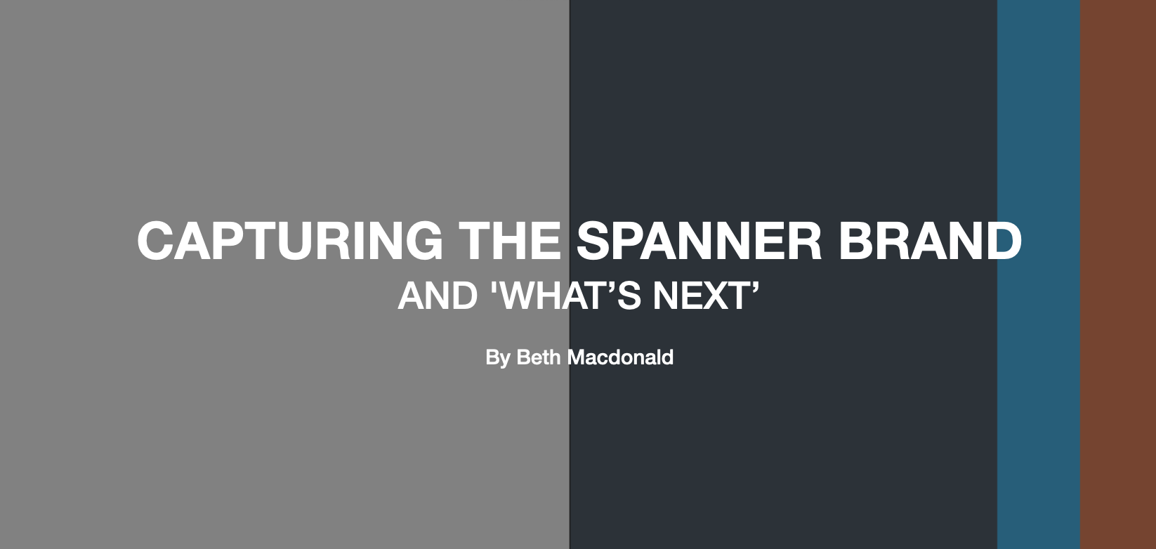
Capturing the Spanner brand and ‘what’s next’
As is typical with this time of year, I’ve spent some time looking back on and capturing the last twelve months to lay the groundwork for 2024 projects and prioritization. This happens to also time out with my year-long tenure at Spanner so it’s been a true opportunity for reflection.
When I joined Spanner, two things rose to the very top of the priority list: collateral/tools to support the Business Development (BD) process, and brand. Addressing the BD needs, specifically in a time of economic downturn and general headwinds within the tech industry, would seem like the obvious first step, but going down a collateral wormhole without brand alignment is a recipe for future pain. With that in mind, we decided to address the brand as a first step.
Refresh vs. Rebrand?
Much work had been done with the brand over previous years via workshops, internal exercises, and otherwise. Spanner had a brand - a feeling or personality if you will - but it hadn’t yet been fully synthesized or taken over the finish line. The reality of a global pandemic and the need to survive as a business had taken precedence for obvious reasons. Rather than start from scratch, it made sense to analyze and parse through the work that had already been done to go the route of a refresh. Even with this decision, I knew we would have months of work ahead of us. We needed to move efficiently with the caveat that we would first need to move slowly, deliberately, and methodically. The outcome would be clearly defined brand guidelines that would serve as a foundation for external and internal facing collateral. On the list: a mission statement and accompanying value statements that would stand the test of time no matter how our business evolves, visual updates including palette and font, an updated tagline, and more. Not on the list? The logo/wordmark. We needed to be laser-focused and logo exploration is anything but.
Here are some highlights of the process and work we’ve done to date:
Getting Started
Because a brand is most often associated with visual, design-based assets, the steps toward capturing a brand accurately and authentically are often overlooked. Decisions may be aspirational-based; what appeals to the eye. And yes, while this is critical, it should be coupled with the foundation of who your business is. What do you represent? This can be an exercise in eye-rolling from some, “How does talking about our values help us to determine what font we’re going to choose?!” But when you capture the values of your company, the words that describe you best - friendly and approachable in our case - suddenly an ALL-CAPS treatment on the website menu can appear “off-brand.” As our COO likes to say, “We’re not shouty!”
Image (pulled from brand guidelines): Words that describe us best

The Palette
Spanner at its core is a California company. It is part of the brand and part of the culture, and of course, it has an influence on color. Since its founding in 2014, an azure blue has served as the main accent color which had been implemented initially on black then charcoal as the primary contrast colors. Tugging on those words that describe us best - friendly, approachable, trustworthy, knowledgeable - and wanting to maintain the California vibe, we decided to keep an updated accent blue that was a touch brighter and had the ability to stand out more. The black/charcoal as a contrast background color did not feel on-brand at this stage and arriving at what did was probably the most challenging aspect of this whole process. We first experimented with different shades of gray all of which felt and looked flat. We were also putting collateral out at this stage and enduring critical internal feedback - “This isn’t the final brand decision, is it?” - was both hard but super informative. Then one day, the perfect navy presented itself. Evoking the ocean or a beautiful leather-bound book, it was sharp and modern while allowing accent colors, or white text, to stand out against it. It was powerful and it made sense. Once we had the azure and navy down, we wanted to incorporate one final accent color. A bit of yellow, green, and red experimentation led us to an orange with red undertones which both stands out on the navy but also, “evokes a mallard,” as observed by one Brit on the team. Cheeky.
Image (pulled from guidelines)

The Tagline
For a few years, the Spanner team had been utilizing the tagline; “Making what’s next real”. This tagline certainly captured what we do - we build the future, we build the products that have not yet been made (or even thought of!), but we still felt it was worth exploring. We threw around a bunch of ideas, but there was an initial thought of going with a simpler version of the original: “We make what’s next” - short, snappy! - but I felt that it was missing out on something key to Spanner: our process. I wanted our tagline to speak to both the products we make as well as to the people - the clients - we work with. Our role is to guide our clients through the product development journey, helping them with their present challenges, but always looking ahead to let them know what is coming next, what they should be thinking about, and how we can help them navigate accordingly. Finally one day it just came down to just that: “what’s next”. It speaks to both the products we build and the process we instill, and it can be incorporated throughout our messaging. And from there it just gets fun – let’s talk about what’s next, we make what’s next, tell me what’s next, and so on. With this treatment, we decided the “what’s next” should have its own color treatment so that when it was placed in the context of a phrase, or on its own - see the logo treatment - it would always stand out.
Image: “Let’s talk about what’s next”

Finally, we needed to determine how the tagline and the logo would cohabitate. In typical type A fashion, I initially went with centered and symmetrical. It was…fine. Then one evening, I had the idea of shifting the tagline over to the right and immediately it clicked – it looked good but, more importantly, it captured exactly what the tag and Spanner represent: forward thinking, the next step, the next product.
Image 1: Logo with centered “what’s next” | Image 2: Logo with right hand “what’s next”


Looking back. Looking forward.
As they say, “Perfection is the enemy of progress.” Put that in the context of a design firm with the highest of standards coupled with a certain amount of urgency around marketing and BD collateral needs, and let’s just say there is a requirement to get comfortable with the uncomfortable. ‘Good - Better - Best’ has been my mantra and it's now become a very familiar mantra to others. There have been, and will continue to be, those moments of, “I don’t love it but it needs to go out.” We will always be critical, it’s in our DNA. When we began the brand refresh project, we went in with an understanding that many things could change or be challenged - and that is ok. The only things written in stone are our mission and our values. There will be continued evolution to our decks, newsletters, proposals, the website, and beyond. It’s critical that we recognize and acknowledge how far we have come but also where the challenges remain; a touchstone of maintaining brand consistency without the brand being a constraint to progress.
***
Note: It takes a village to do a project of this nature. A tip of the hat to our designer, Catherine Headen, whose guidance and patience has been so critical throughout. And to Torence Lu, our fearless COO and resident brand gatekeeper for keeping us on the straight and narrow while also leaning into the idea that a bend here and there is A-OK.

Beth Macdonald, VP of Growth, leads Spanner marketing, BD, brand, and partnership initiatives. In her words, “I do everything the engineers don’t do!” Collaborating with clients and helping them to achieve their goals is a highlight of her day-to-day work.
Beth is based in Boston and loves hiking with her dog, taking too many cat photos, and spending time with her family.
Interested in learning more about what it’s like to collaborate with Spanner?